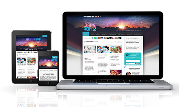
This week, I’ve been partnering with a large client in a couple of different areas of its organization. One group within the organization is developing a very hip and visually interactive game to teach sales associates about the company’s products. The other group is developing a simple mobile application that’s essentially a product catalog listing the basic features (e.g., pricing, etc.) of their many products. This also serves as a tool for sales associates.
When meeting with the customer to review the proposal for the mobile application, the client posed a great question: “Why is the cost so much more to develop my simple mobile application than it is to develop an interactive, whizzy game?” Smart client.
The answer is simple and as easy as cake to understand. Let’s start with the background, and then we’ll get into the cake part.
A few basic elements impact the price of a product, be it an e-learning course, a mobile application, or a highly interactive game experience. Based on the complexity of these factors, your price goes up or down:
- Instructional approach – Elements like the length of the course, traditional lecture learning vs. immersive scenarios, and the number of activities and assessments, etc.
- Visuals – The amount of custom graphics, 3D vs. 2D, stock photos vs. a photoshoot, avatars, illustrated environments, and user interface (UI) design, etc.
- Engineering – Programming complexity (e.g., simple back/next features or a complex branching scenario with many levels), user navigation, and LMS integration, etc.
- Devices – The types and number of devices (e.g., employee laptops, iPods, iPhones, and Android tablets, etc.) on which the product needs to run.
In this case, one real kicker impacted the price: Devices. The game we’re developing is designed to run on a learner’s computer. Therefore, it just needs to be compatible with popular Web browsers. While the graphics and animations (think really cool 3D zooming and detailed product shots, etc.) are on the whizzy/fancy side of things, we only have to create everything once because it’s running on one type of device.
On the other hand, the product catalog is designed to be mobile and run on a variety of devices such as iPads, the iPad mini, iPhones, Android phones, and Android tablets, etc. While the visuals aren’t as complex, the engineering effort certainly is—not to mention the QA and testing that goes into developing a mobile app for so many devices.
Let’s use an analogy based on one of my favorite things: Cake.
Say you’d like to bake a chocolate cake. The ingredients you need are the same, whether you’re making a round three-tiered cake, a rectangular cake, or cupcakes. Your ingredients cost about the same more or less, depending on the amount of cake you want to have on hand.
However, if you want to bake all three types at once, you’ll need more ingredients and more tools (e.g., cupcake tins and cake pans, etc.), and it takes more time to assemble and decorate each cake type. For example, assembling and decorating a birthday cake is much faster than a wedding cake. Cupcakes take time as well, depending on the design you want to put on them and whether you’re using a filling.
The same goes for a learning product. The more formats you need, the more labor-intensive the product is to develop, thus increasing your investment.
When you’re on a limited budget, one of the best investments you can make upfront is a short analysis to determine the right mix of devices for your audience. Perhaps you don’t need a wedding cake, a birthday cake, and cupcakes; maybe you just need two of the three.
Now, if you’re like me, you’re really ready for a slice of cake!


